QT9 BI Tool Demo: Building Quality & Operations Dashboards
December 2nd, 2025
Full Webinar Transcript
Hello and welcome to the QT9 webinar on the business intelligence tool. Today we're going to be talking about how you can transform data from your QT9 QMS, ERP, MRP, as well as external data sources to form interactive dashboards, KPIs, and reports.
A few preliminaries before we get started. Inside your window for the webinar, you're gonna see a toolbar panel. You can use the orange arrow at the top of the panel to either open it up or collapse it. Now at the bottom of the toolbar, there's gonna be a box where you can send in questions. We have a few members of the QT9 team on this call, and they will be able to answer your questions throughout the presentation. Additionally, we're gonna take some time at the end of the presentation.
To answer any final questions that you might have.
Additionally, after the conclusion of the presentation, you'll be sent a survey to ensure quality for future webinars. We'd appreciate your feedback in that survey. Lastly, if you would be interested in getting more information on the BI tool or of any of the other QT9 products, reach out to one of these two email addresses here. If you are a present QT9 customer, you can reach out to Customer Success at Qt9software.com.
Otherwise, if you are new to QT9 and would like to learn more, reach out to sales at qt9software.com.
Now, to get into the plan for today, we broke this out into a few different topics. First, I would like to introduce what the BI tool is and what it is capable of doing. Then, for the rest of the call, I would like to focus on actually demoing the tool for you. We're going to show how you can log in and navigate the tool. Then we're going to spend about 30 minutes focusing on the dashboards side of the tool, which is the real kind of value portion that you can build your own analytics with. Then
Towards the back end of the call, we're going to spend some time showing how you can generate reports and using the new query editor. Finally, as I mentioned before, we're going to spend about 10 minutes at the conclusion of the call to take any final questions that you might have.
So let's jump into it. What is the QT9 BI tool? The Business Intelligence Tool is an analytics platform which provides real-time insights into your enterprise data. This tool delivers value by granting users access to all of the data captured by your QT9 QMS, ERP, MRP, and now external data sources. So no longer do you need to go into a grid in one of these tools.
And then export the grid and manipulate the data in another environment. Now you have a separate tool, this business intelligence tool, which is already connected to all of your data in real time and allows you to build those analytics within that platform. Additionally, beyond the QT9 products, we now also allow you to connect to certain external data sources. And this is part of the 3.0 release that released this past weekend.
These external data sources include MySQL databases, RESTful API endpoints, as well as Excel uploads. Now, with all of this data, you can build interactive dashboards, generate reports, and run SQL queries on your data. So we provide a couple different avenues for you to build these analytics. Now, one final point I'll stress here.
This BI tool is its own separate product. This is not a module for any of the other products. It's not a module of QMS or ERP. It is its own standalone tool. And now I'd like to jump into kind of showing what that tool can do.
So I am now presenting the login screen. Of course, if you do have SSO ⁓ set up, you can use an SSO login. Otherwise, you can always log in with the classic email and password set up. And that is what I'm gonna do in this presentation. So I'll sign in. It will now email me a code that I can use.
And I will enter in that code and sign in. And there we go. We are now in the BI tool. And I start off landing in the homepage. And one of the really handy things about the BI tool is you can set up a particular dashboard to appear right away on your homepage. No need to navigate to a particular folder. If you or your team have a particular set of KPIs or metrics or analytics.
That you want available right away, you can have that immediately as you log in. Now, in a couple minutes, I'm going to show how these dashboards work, but I'd like to first kind of show you around the screen here. On the left-hand side is the menu. And at the top of the menu, of course, we have the home button, which gets you back to this page that we're on now. Below home is a couple of those features that we had previously mentioned. We have dashboards.
Reports and queries. And each of these have their own pages within the drop downs. And we're going to talk about a lot of those pages as we go through this presentation.
In the top right corner, underneath where you can see my name and email, there's a few pages here. The one I'd like to stress is this help center. So if you are already a QT9 customer, you might be familiar with this, all of our products come with a help center, which is a set of documentation that you have available to you. So if you need ⁓ some resources to help ⁓ explain how you build a certain dashboard or connect to your
UDF information or any other ⁓ kind of analytics that you'd want to accomplish with the BI tool, that help center is going to be a great guide for you. So now let's talk about the the elephant in the room, the dashboard that's on our home screen. So on this dashboard, I have focused this on Kappa records. So this is our corrective actions. And as you can see we're pulling all of this corrective action data and summarizing it in a bunch of different ways.
So we can summarize it as a pie chart, a line or bar chart, a line chart with a trend line within it. And as I scroll down, you can see we have pivots and even a simple grid. And this is just a couple of different options. We have a wealth of different options that you can use to display this data. And as I kind of previously mentioned at the beginning of this call, this is all live from your site.
You don't need to export a grid and then kind of manipulate that data into a particular reporting format. This is available in real time in a dashboard that you can always return to. And what's really handy is then you can apply filters to this dashboard. So for instance, I have two filters set up at the top of this dashboard. One for submit a date, where I can select a pair of dates. For instance, let's grab the entirety of
this year. I'm going to grab from January 1 to December 31. And there we go. We have filtered our dashboard for this year. Or alternatively, instead of selecting a pair of dates explicitly, we can also select a range. So for instance, if we want to get the last seven days or the next month or the last quarter, right? We have a bunch of inbuilt ranges of dates as well.
And this is really handy if you have some type of report where you're reporting on it ⁓ quarterly or monthly. You can then build the report one time and then apply a filter either on the submitted date or a date created or some other type of date field, and then get that subset of your data. And then beyond even just date fields, you can filter based on any other type. So for instance, if we want to select a particular supplier.
We could do that. Or if your company is multi-site, you could add a site filter at the top. Another use case I've run into is if you're doing a training reporting and you like to filter based on the departments that a particular employee is a part of. You can add a department filter at the top. Now, each of these charts, beyond just having a filter at the top, each of these charts are also interactable.
So for instance, I can open up a chart into a full screen mode or even take a peek at the underlying data for the chart.
I can also do a feature what's called which is called drill down. So for instance, on this pie chart, I've configured this to show corrective actions by status and responsible party. Now on the first layer, as you can see here, we're showing it by the ⁓ response by the status. So for instance, this wedge is for your closed records. We have our rejected records. And in fact, let me reset our date field here so we can see all of our records.
Right, so we're breaking this down by status. But what the drill down allows us to do is select a particular wedge, for example, our open capital records, drill down into the open, and now see a filtered view of those records just for the open status. And this is now broken down by the responsible party. Right. So if you wanted to see the responsible parties for a particular record.
Or if you'd like to see the approver's broken down particular record, we could add that drill down feature and allow you to really kind of zoom in into the particular set of data that you want to access.
Now, on top of just interacting with this dashboard, I'd like to show you some of the pre-built dashboards that are available to you. So if I go to dashboards and then to the tab underneath that for view, we are presented with this grid of all of the dashboards that I have access to.
Now, this first set, this demo dashboard and home dashboard, these are all ones that I have built using my user up here. But if I filter just for what we call the system defaults, we can view this library of pre-built dashboards. And the really handy thing about this is all of these dashboards are available to you right out of the box. You don't need to do any extra work. You don't need to build any of these ones here.
Day one, when you have the BI tool, you can utilize these dashboards. So for instance, if I go to Kappa Supplier Quality, I can open that up and view the dashboard. And if you remember, this is actually the one I have pinned to my home page. But if I go back to the grid, I can look at a few of the other modules. So for instance, we have some analytics relating to customer feedback.
Or on the ERP and MRP side, we could also open a dashboard relating to inventory. So for example, I have this aging and expiring inventory report or dashboard as well.
Now let me return back to the the customer feedback here.
With any of these dashboards. As I said, they come right out of the box. But in the top right corner of any pre-built dashboard, you also have this copy dashboard button. So if you'd like to, you know, create your own version of any particular dashboard or modify it, or even if you'd like to see how it's built, you can copy any dashboard we have provided to you and you know make your own version, tweak it, edit it. That's all available to you.
Instead of going into that direction, however, what I'd like to kind of gear the next kind of 20 minutes or so to is to build our own dashboard from scratch. So let's go ahead and start working through that process. I'm gonna begin by going to dashboards and then to build. And by clicking on that, we are brought to a blank canvas where we can start adding our visualizations.
Let's start by giving our dashboard a name. I'm going to call this just my webinar dashboard.
And then in the top right, I can use this button to add our first visualization.
Now, the first step in adding a visualization is we need to tell the tool where do we want to pull data from? You know, what tool, QMS or ERP, do we want to access? And then which module within QMS or ERP or even MRP do we want to access? While we're here, I'd like to take one moment to point this out, however. Beyond QMS, ERP, and MRP.
You can also report on any Excel file that you upload to the tool. You can also ⁓ access any ⁓ RESTful API ⁓ data source that you have set up as well. And I don't have an example here, but you could also configure a MySQL database. So any of these analytics, whether relating to QMS or even on their own, you can report with this dashboard. Now in this
Demo, what I'd like to do is just focus on Kappa. So I'm going to select QMS data source for our data. And then let's scroll through these options here. So we're pulling from QMS, but now we need to say what module do we want to pull from. And each of these different options are what's called a view. Now, a view is essentially a different data table that we're pulling out of QMS, right? You can think of them as
A grid of data that we want to report on. So for instance, if I scroll down here, you can see that we have all these views across these different modules, calibrations and change control. And if I wanted to, I could even peek at the data underneath. So for example, our change control records, I could take a look and preview the data. And here is that underlying table, right? So this is the this is the data that I'd be reporting from. And again,
As previously mentioned, this is all pulled live from your system.
Any data points that you see in QMS, ERP, or MRP are going to be available to you here. Right. So you know, if you were trying to report on the training module or ⁓ a management review in QMS or an ERP and MRP, if you want to report on jobs or purchasing, that data is all available to you. Now, as I said before, let's focus on corrective actions for our reporting here.
So I'm going to select corrective actions and select data. So we've accomplished step one. We've selected our data for this chart. The next step is to actually configure the chart. The first thing I'd like to draw your eyes to is where it says column here. This is where we can change our chart type. So as I was showing towards the beginning of this call, you can choose many different options of how you want to display your data. Of course, we have the
the classic grid and pivot pivot table, but if you prefer a more visual approach, we have of course columns, bars, pie charts, and as I scroll down, you can see a bunch of different options here.
Let's start off with beginning with a just a simple pie chart.
And in this pie chart, I would like to recreate the one that we had on my homepage. And if you recall, that pie chart was the number of corrective action records by status and responsible party. So I'm going to go ahead and give that a name up top. Now to actually build out the chart, what we do is we drag these fields here into these boxes here.
So these fields, you could think of them as different data points or columns of data from our table. So ⁓ first, let's grab our status field and put that into the pie charts label. The label for our pie chart is basically the wedge or the thing that we're pivoting on. Next, we need to give the chart something to count, right? So, how do we count these records? And the
Best practice for counting records inside the BI tool is to locate the ID field, you know, corrective action, action ID. It's a unique identifier for this record. And we're going to put that into value. Now, you know, the every table is going to have its own ID field. Training records is going to have a training record ID. Your inspections is going to have an inspection ID. For corrective actions, it's the action ID. So I'm going to grab that, drag it into value.
And there we go, we've built our chart. Now, one final step before I talk about this a little bit more. By default, the system is going to sum anything that you put into the value. We're going to change that to a count. So I'm going to left-click and change our aggregation from a sum to a count. And simple as that. We've built our first pie chart. We're now counting the number of corrective action records.
by their respective status. And that's as simple as that. ⁓ This is one a misconception that I think some people have. You know, building analytics doesn't need to be a complicated process. As you can see, just with a couple of clicks and we just drag a couple fields, we can quickly build out a pie chart from our data.
Now, let me add one more final detail to this before we save it. As you can see, above our chart, we have this little button saying add visualization filter. Now, there's many ways of filtering data in here, but this is the one that I'm going to focus on for right now. If we click on add visualization filter, we can select any other field that is on our view. For example, the corrective action type.
And we have simply just added a filter. So this is interactive, just like any other filter that I was previously showing. And I can select, for example, the audit issue records.
Customer feedback records or any other corrective action type. Let's go ahead and leave that as all.
Finally, I'm to go ahead and save this chart. So it's going to be a two-step process. We're first going to save the chart. We're now back on our dashboard view. We could even resize our chart so that we can give a little bit of extra room for additional charts in a few minutes. And then we can save the dashboard itself. And just like that, we have made our first dashboard. Now, again, I want to reiterate from the beginning of the call. At any point, if you have any
questions on anything we've covered, feel free to send them into the questions section of your toolbar and we'd be happy to answer that throughout this call. All right, so we've built our first dashboard. So if we were if we go to dashboards and then view, and this is that grid that we were locating those default dashboards earlier, you can see that my webinar dashboard has been added to this list. And if I were just to click that, I've returned to my dashboard.
So let's add a little bit more detail to our dashboard here. If I go into these three dots in the top right corner, I can edit this and start adding additional visualizations. For instance, let's go ahead and add a bar chart. I'm going to do this a little bit quicker now, just to show that it is a simple process. We've selected corrective actions as our data. We're going to change our chart type to a bar.
And in this case, we're gonna grab ⁓ type and we're gonna grab action. And again, we're gonna change that from a sum to a count of distinct rows. And there you go. Simple as that. We have now built a chart to count the number of corrective action records by their type. Let's go ahead and update this name here.
Now, I'm not going to get into a lot of detail on this next point, but I do want to show this off. With any of these charts, there's many settings available to you for you to customize it and display it exactly how you'd like. So as I click on any of these, you can change how the axis title appears. This is your y and x axis. If I look at that action ID, you have both this ⁓ sorting options, you have a number of formatting options.
and as well on the ⁓ the entire chart itself, a bunch of different ways you can customize this. So you can really tailor any chart and therefore any dashboard to the presentation that you need to have it. I'm gonna leave all these just as the defaults for right now.
I'm gonna go ahead and save and add that chart. Let's actually pretty this up a little bit. I'm gonna resize the other one so they're the same. And there you go.
Now, if you remember from the original dashboard that I was showing on my homepage, we had that drill down feature on our original pie chart. And that is actually something we've not quite added yet, right? This pie chart that we made originally, we were showing the number of corrective action records by status, but we never added the ability to drill down to a responsible party. So let me show you how that is done. If we go back into that pie chart, we can locate our
responsible party record excuse me field and drag that into this box here saying add hierarchy right so we basically add another field to our list of labels. Now if we save our chart and interact with it we can select our open wedge and drill down into the individual responsible parties right and of course this works beyond status and responsible party
If you like to cross cross-reference you know a pair of category fields or ⁓ a date in another field, you can do that, right? So this can really be kind of tailored to your particular use case. Now, another way we can drill down, and this is be a a really great illustrative example, is we can create a a trend line for our corrective action records.
And the way we'll do that is let's add another visualization, again using QMS data. And we will navigate to corrective actions. But this time, let's leave it as a column chart. This time for our label, let us put another field called timestamp in there. Now, timestamp for our corrective actions is just the date it was created, right? So this is the timestamp at which
that corrective action record appeared. So if I drag our timestamp into the label, it creates this drill down automatically from year to month to day, et cetera.
Let's go ahead and do that second step as well. We'll put the action ID into the values, change this from a sum to a count, an update, and there you go. We've created our trend line for our data.
The handy thing here is, as I mentioned, this this automatically builds out a hierarchy for a date field. This means that if I save this, let's go ahead and expand this out a little bit here. If I save our dashboard, I can click on a particular year. For instance, let's look at records from 2024. I can select 2024, drill down into 2024, and then see a breakdown by month.
Then, if I wanted to look at a particular month, I can look at July of 2024 and break that down by a particular day. Right. So, really, we can tailor this to exactly how you want. We can allow you to drill down and zoom into a particular chart however you want. Really, this can be customized to your needs. Now, a couple final steps I would like to do on this dashboard before we move past dashboards. First off,
Let's add a filter to our chart. Excuse me, filter to our dashboard. Now I added one filter earlier to this pie chart. And if I open up our pie chart into a full screen view, you can see that this corrective action type filter was added to our pie chart. But we might want to add a filter to the entire dashboard. And the way we do that again is go to edit, add filter.
There's couple options here. We're going to start with add dashboard filter. And we can select a a field that we want to use for the filter. So for instance, if we wanted to look at a particular ⁓ department or type or site or something like that, we could use that. In this instance, what I'd like to do is just create a simple site filter.
Let's clean up the name a little bit. I'm just going to simplify that to site and let's create the filter. And just like that, we have added a site filter at the top of our chart. So now of course this is interactable, just like any other element of our dashboard here.
Now, the next thing I'd like to show off is one of the more advanced features of these dashboards. And I'm gonna begin by showing that off by creating a grid of data. So let me select our corrective actions as our data source. And in this case, we're gonna change our column chart to a grid, right? So a grid is just a simple table. This is gonna be raw data.
you know pulling from your QMS. And let's add a couple columns to our grid. We can add action ID, we can add corrective action status, perhaps a type. And the next thing I'd like to do is add a few date fields. For instance, let's grab our submitted date.
And our date approved, right? So submit a date. When did we send this in for a review? And date approved when it was actually approved, right? So you can see there's some you know disparity between these, right? So it took a couple days here, here it was done on the same day. for this record, it looks like it was about two weeks later. So in this case, let's say we wanted to create a KPI to count the number of days between these fields.
Right. So how many days does it take to go from a record being ⁓ a corrective action record being sent in for approval and it actually being approved? Now, of course, this has kind of broad uses. Do we want to compare today's date with the due date of a particular record? Or if you're looking at you know document management, you know, how long does how long is the life cycle for a particular document revision, or how long does it take to approve a particular document revision? So
You know, obviously, this can be applied to any other module in QMS, ERP, or MRP. In this situation, like I said, let's count the number of days between submitted date and date approved. Now, to do that, what I'll do is click this blue plus button above our fields and use a calculated field. Now, a calculated field is like a KPI.
Or a custom formula that we build from our fields. So for instance, I can search for a particular function. For example, date diff, and let's click on that. And if we read the documentation here for date diff, you can see it returns the difference between two dates in the indicated lapse, lowercase d for the number of days. And
Any function that we want to use to build out a KPI or metric here has that documentation in here. So you can read through these and kind of find the one that's most relevant to your use case. Here we're going to use date diff. For date one of our date diff, we're going to use the submitted date. For date two, let's go ahead and use that ⁓ the date approved.
And lastly, for our laps in double quotations, we'll put a lowercase d. Now, kind of one final point. Let's put a name on this, number of days to approve, done, and create field.
If I scroll up here on the list of fields we have on the left-hand side, along with any of the fields that are native to the corrective actions view, we now have added this new custom field to the list. And this custom field works just like any other field that we have on this list. So I could add it to our grid. I could add it to filters if I wanted to, right? So this works just like any other field. And as you can see,
Right. It took about 12 days here, 744 days here, right? This is demo data, obviously, but you can see we're counting the number of days between these dates. Now, displaying this as a grid might be useful in some circumstances, right? If you wanted to show the number of open records and then have on the table a number of days until due or something like that, that might be one use case for this.
But another use case for like a days to approve kind of KPI is maybe we just want to show a single number. Like what is our average overall for days to approve? And instead of showing that as a grid, let's restart this. I'm going leave the field that we made, but I'm just going to take all these fields off and we're going to select a different chart type altogether. Instead of a grid, let's select a text field.
And this text field is very good for KPIs. Now there's a couple other KPI options for our chart types. This is the most simple. So that's what we're going to start with on this demo. In this text field, we can put a value into the into excuse me, put a field into the value to sum or count or average. And here we're just going to take the days to approve, put it into the value. Again, I mentioned earlier this defaults to summing.
We'll change that from a sum to an average and update that. And there you go. Simple as that. We've we made a KPI metric for every record. And then now we're averaging that record. ⁓ we're averaging that value across all of our records. Let's give this an A. we'll call this average days to approve corrective action record.
Let's go ahead and save this chart.
Going expand this out a little bit and we're going to reformat this a bit. And now I'm to drag this to the top of our dashboard. Right. So if you're building a dashboard, and this might be especially helpful for an executive dashboard or a dashboard that might be on your homepage, you can add a bunch of KPIs right at the top to show your team metrics. You know, how many records have we processed this month? Or what is our goal to hit a particular
KPI or something like that, right? So we can add this metric off at the top and then apply any filters, a site, a team, a department, a date range, and all of that.
Now, ⁓ two other points I'll I'll say before we ⁓ wrap up with dashboards and begin talking with a few of the other features on this tool. So, first off, you can report on you know multiple modules of data for a dashboard, right? So if you wanted to compare corrective action records and also include preventative actions or non-conforming products or quality events, right? You can include all of that data on the same dashboard. And that goes across
Products as well, right? So if you want to compare your QMS data with ERP data, you can combine that too. So for instance, if you want to compare your non-conforming product data coming out of QMS with your purchasing data coming out of ERP or from any other data source, right? You can create a dashboard that combines that data. And that's really where the power of this comes in is cross-referencing all those data points.
Lastly, ⁓ while this is designed to kind of provide you that platform to build all these analytics in one spot, we still do provide you the ability to export this data out of the BI tool. So if you build out a dashboard with all these different metrics and data points, but you'd still like to take the kind of final resulting ⁓ dashboard out of the tool and share it with someone, you could do that, right?
So if we wanted to export that to an image, to a PowerPoint, PDF, or Excel, those options are still available to us.
All right, so that pretty much wraps it up on the dashboard side of things. Let's begin talking about a couple of the other features inside this tool.
So next on the docket here is reports. And I'm going to navigate to the view page for reports. Now, reports work a little bit differently than dashwords. First off, reports can only be built by the QT9 team. So you don't have the ability, unfortunately, to edit these reports. Now, I would like to kind of emphasize this: there is no data.
That is unavailable to you in dashboards compared to a report, right? You can still always access that data and build out any dashboard that you want. Reports are just ⁓ taking this data and formatting it in a slightly different way. I'm going to show that to you in a minute, but you still have access to all of your data. But these reports are just built only by the QT9 team. Let me show you how one of these work.
I'm going find our training reports here. And let's locate the training delinquencies by department report. If I click on that, on the right hand side, we're going to select a couple different parameters. And these work similarly to the filters that you saw on the dashboard side, but these are just often mandatory for to be filled in. So let's grab a site. I'm going to grab corp for a corporate.
And let's select all for our departments. And now this report is going to be generated. And I'm actually going to zoom out just a little bit to make that a little bit more clear. Right. So what this report is doing is for each of the different departments that we have selected for the site that we're we were viewing, we get a list of employees associated with that department who have ⁓ delinquent trainings. So
can see here you we get the information relating to the document for the training, the training date, the number of days past due. And if I scroll to a couple later pages, you can get to those other departments as well. So these reports are kind of designed in a ⁓ tabular document structure. And that's the other kind of big difference here. I can put this in maybe a print preview and give you that look here.
Right, these are designed to be able to be either downloaded as a PDF and then shared as like a document or something like that. That's that's typically what we design these to be. Another really great kind of ⁓ illustrative example on that point is if I actually return to reports and look at our certificate of analysis reports.
It invites me to enter in a particular inspection number. For example, I know we want to look at number 62. So let's go ahead and enter that and we'll click preview. It is now going to generate this certificate of analysis report, right? Looks a little bit different than a dashboard. And instead of displaying this data as a series of charts and figures, it's more showing as a document, right? We have our lot and product information at the top.
We have our inspection question information and the results for those questions there, right? This is designed to be kind of sent out as a PDF or downloaded or printed or something like that. So by and large, you know, these reports are designed to act as kind of supplemental printouts that we don't have natively in QMS or ERP. ⁓ let me go ahead and zoom this out just so you can see that.
full document. Now, these are only built by the QT9 team, but you can request a custom report to be designed, either as a modification of one that's inside the BI tool or as an entirely new report. And that's something if you are interested in doing something like that, my advice would be to reach out to your customer success representative and they can help scope that out with you.
One final report that I would like to show before we move on to the next topic is of course, we can also report on ERP information as well. So for instance, I can look at, let me find this here, the supplier performance report. In this instance, it's going to invite us to select a pair of dates. So let's grab our data from 2024. So I'm going to grab July, excuse me, January 1st.
To December 31st of 2024 preview and generate this report. Again, I'm going to zoom out a little bit for this demonstration. Right. This report is summarizing supplier performance. So for each of our suppliers, it is listing out all of the different POs that we have ⁓ purchased with the supplier over the course of this time span and gives us some metrics on.
the performance of that supplier for that PO. So how many did how many did we receive versus how much did we order? You know, did it arrive on time? And if I scroll through here and find the end of this first supplier, you can see that we have a final summary for all of these records, right? The totals and percentages for overdue and on time, right? So just like ⁓ just like with the
⁓ the dashboard out of the box ⁓ options, these reports are available to you as well.
Now, one final area of the tool that I would like to highlight before we end this webinar is this query editor. And this query editor is actually one of the new features that came out with the 3.0 release this past weekend.
I will be a little brief with this as it can be a little complex, but we wanted to give ⁓ the users of our BI tool the kind of maximum access to their data that we can provide. This query editor allows us to ⁓ build a query based on one of our products. And right now I've set this up for QMS and ERP. Let's just grab QMS for right now. And it allows us to directly read data from our database, right? So all of these products.
Are built on top of a database that stores all of our modules as data. And here we can directly query that data. So if you or someone on your team is kind of technically proficient and ⁓ maybe knows at least some basic SQL or SQL, you can write these queries and directly interface with your data. I'll do a quick example here. I can look at our tables from the database. For example,
Audit and this can be built either visually using this interface or textually using this down here. And let's go ahead and select a couple fields from our table.
We can then execute the result and we get that grid of data pulling from our database. Right. So this is a little bit of a simple example, but hopefully you can see the the what we're trying to build towards, right? You can directly get the data out of your system if you need it.
I set up a a little bit more of a complex example, which I'll just briefly show. I have this document query in here. And this document query is attaching a bunch of different tables from our system. So we're pulling in site information, documents, revisions, departments, etc., and building out this quite complex report down here. And now if I execute this report, you can see we get this large grid of data summarizing all of that together.
And if we wanted to, we can then either save that query so we can access that data later, or we can export this data out to Excel, just like what we could do with the dashboards.
Of course, this is a more complex option, right? ⁓ you might need to know a little bit of SQL and some data model information to be able to accomplish this. And you know, we do have, as I said earlier, additional information in the help center that can help walk you through that. But our goal through all these modules is to not only give you access to the data coming out of your any of your products, but to provide many different avenues for you to show, display.
and share that data.
So that concludes our presentation for today. I think we wrapped up about three minutes early here, but I'd like to thank you all for joining. ⁓ as I mentioned at the beginning of the call, there's going to be a survey after this, and we'd appreciate your response on that survey. Additionally, again, you can reach out to customersuccess at qt9software.com or sales at qtninesoftware.com if you'd like to schedule a demo or ask additional questions about the BI tool.
Lastly, we're going to take just a couple extra minutes here to answer any final questions that you might have. So feel free to jump into that toolbar question section and send in any questions about the tool.
I believe someone did ask earlier. ⁓ you can use UDF data as well. So you can report on any UDFs, and that goes for both products.
Gonna give us a few more minutes. Feel free to send in those questions.
Another person asked if we can ⁓ also run this BI tool on premise. Yes, we can. So if you are on premise for QMS, ERP, or MRP, this tool can be configured to work on premise. Yes.
Someone asked about custom reports for the BI tool. ⁓ to get ⁓ kind of more information to get a scope and quote on that, go ahead and reach out to your customer success representative. if you don't know who that is, just reach out to that general email we were talking about earlier. So just reach out to customer success at qt9software.com and we can get you kind of directed to the right person with that.
I think we're going go ahead and wrap it up there. Thank you so much for attending. We we appreciate ⁓ you know coming to this presentation and and viewing our ⁓ our our business intelligence tool. Again, feel free to reach out to either of those email addresses. We look forward to demoing this to you in more detail. Thanks and take care.
Questions From This Session
What is the QT9 Business Intelligence Tool?
The QT9 Business Intelligence Tool is a standalone analytics platform that connects to QT9 QMS, ERP and external data sources to create interactive dashboards, reports, KPIs, and queries using live business data.
What data sources can the QT9 Business Intelligence Tool connect to?
QT9 BI connects directly to QT9 QMS and ERP while also supporting external data sources including MySQL databases, RESTful APIs, and Excel files. This allows organizations to analyze data from multiple systems in one place.
How do interactive dashboards work in QT9 BI?
Users can build custom dashboards with charts, graphs, KPIs, filters, drill-downs, and calculated fields. Dashboards update using live data, allowing teams to monitor business performance without exporting information into spreadsheets.
Can QT9 BI create reports from QMS and ERP data?
Yes. QT9 BI includes pre-built reports and supports custom reporting for both QT9 QMS and QT9 ERP data. Reports can be exported as PDFs, Excel files, PowerPoint presentations or images for management reviews and business reporting.
Can users create custom KPIs and calculations in QT9 BI?
Yes. QT9 BI allows users to build custom calculated fields and KPIs using formulas, date calculations, aggregations and dashboard metrics. These calculations can be displayed in charts, tables, and executive dashboards.
Does QT9 BI support SQL queries for advanced reporting?
Yes. QT9 BI includes a SQL Query Editor that allows advanced users to query live QMS and ERP databases directly, build custom data sets, and export query results for additional analysis.
Key Takeaways
Presenters
See QT9 BI in Action
Discover how QT9 Business Intelligence transforms QMS, ERP and MRP data into interactive dashboards, KPIs and reports with real-time analytics.
Request a BI Demo →Explore QT9 QMS in Action
Take a self-guided tour of QT9 QMS and see how organizations manage audits, supplier quality, CAPAs, training, document control and compliance from a single platform.
Launch Interactive Tour →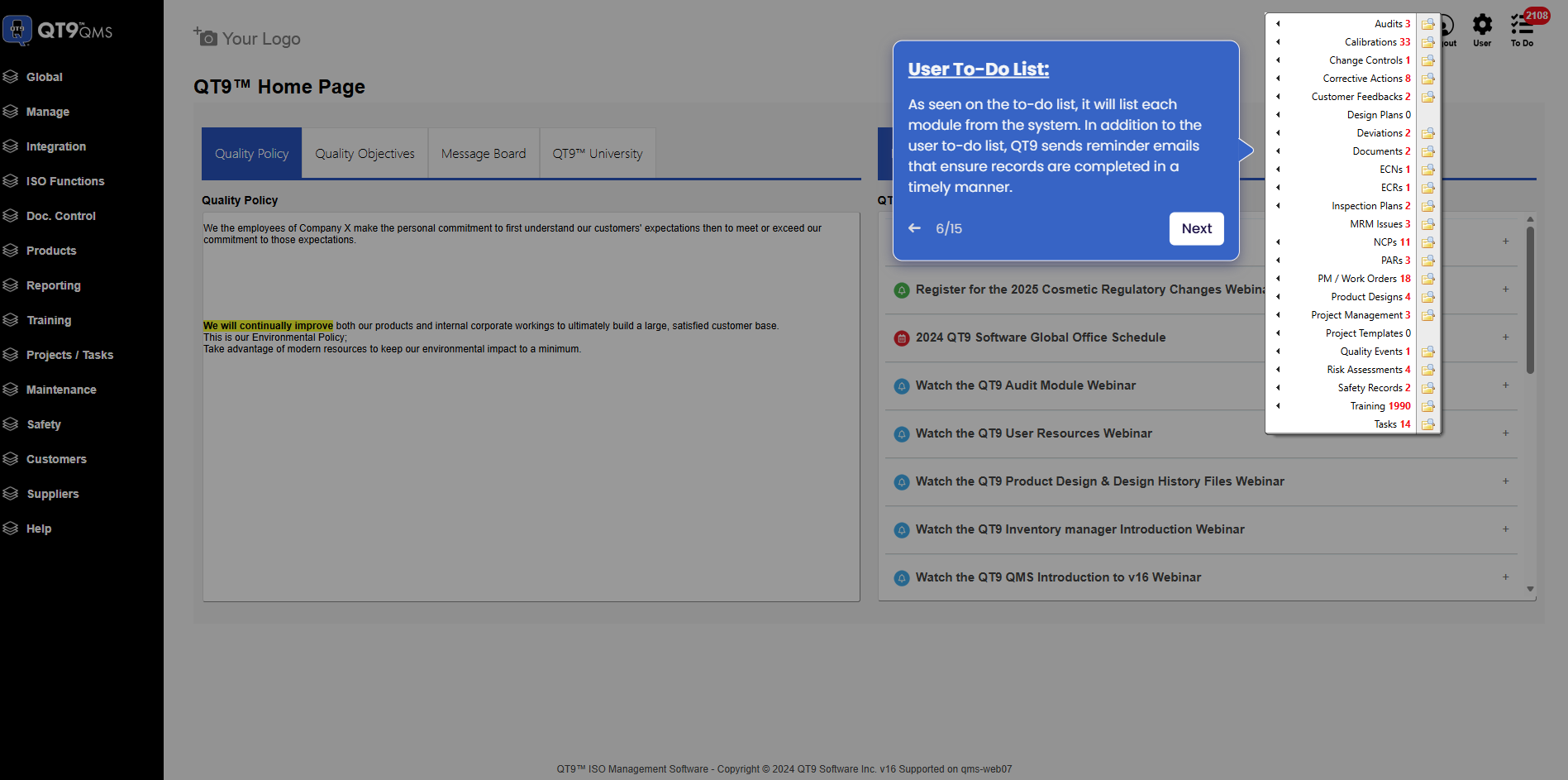
Simplify Quality, Compliance and Operations
Start a Trial
Try QT9 free — no credit card required.
Start Free→
Schedule a Demo
See QT9 live with one of our product experts.
Book a Time →
Get a Quote
Get custom pricing tailored to your team size.
Get Pricing →